Warning: "continue" targeting switch is equivalent to "break". Did you mean to use "continue 2"? in /home/ih1v0f0zxragxwcy/public_html/blog09/wp-content/plugins/jetpack/_inc/lib/class.media-summary.php on line 77
Warning: "continue" targeting switch is equivalent to "break". Did you mean to use "continue 2"? in /home/ih1v0f0zxragxwcy/public_html/blog09/wp-content/plugins/jetpack/_inc/lib/class.media-summary.php on line 87
Notice: Trying to access array offset on value of type bool in /home/ih1v0f0zxragxwcy/public_html/blog09/wp-content/plugins/wc-gallery/includes/functions.php on line 675
Notice: Trying to access array offset on value of type bool in /home/ih1v0f0zxragxwcy/public_html/blog09/wp-content/plugins/wc-gallery/includes/functions.php on line 676
Notice: Trying to access array offset on value of type bool in /home/ih1v0f0zxragxwcy/public_html/blog09/wp-content/plugins/wc-gallery/includes/functions.php on line 677
Notice: Trying to access array offset on value of type bool in /home/ih1v0f0zxragxwcy/public_html/blog09/wp-content/plugins/wc-gallery/includes/functions.php on line 678 L o b a B l a n c a {dot} c o m | If there's nothing wrong with me, maybe there's something wrong with the universe. | Page 2
Notice: Trying to access array offset on value of type null in /home/ih1v0f0zxragxwcy/public_html/blog09/wp-content/plugins/jetpack/modules/theme-tools/site-logo/inc/functions.php on line 106
I didn’t think that I was going to make it through this book in time. I’ve already finished watching both the final movie for my Cravenous series as well as its director’s commentary, and I’ve started working on that post. However, I also knew that I wanted to get his one novel into the mix, too, before we finally (and sadly, for me at least) bring Cravenous to a close.
Mind you, Craven also wrote a 5-issue comics series with Steve Niles back in 2014. Inspired by the sudden idea of “a werewolf, a vampire, and a zombie walk into a bar…,” Craven created Coming of Rage around the notion of these three horror stalwarts suddenly thrown together and the hilarity that would thus ensue. He also wrote the introduction to the very recently released Never Sleep Again, touted as “the ultimate chronicle of one of the most important horror films of the 20th century.”
I’m toying with the idea of downloading the comics (let’s face it; I probably will…even though I wish they would release them in hardcopy as well), and I do have Never Sleep Again already in line for reading this year (I pre-ordered that shizz the first day I could), but that’s not why we’re here today. Instead, we’re here to discuss Craven’s one and only original novel, Fountain Society.
Right off the bat? It’s not horror. It’s far more science fiction-cum-military thriller. Think The Island meets Enemy of the State (kind of; I’m sure there’s a better more military thriller comparison I could make here if I were more familiar with military thrillers). The quick rundown is that the Fountain Society is a secret project, funded, protected, and supervised by the military, in which Dr. Frederick Wolfe has successfully cloned several high-level scientists who have contributed some of the military’s most successful (read: most horrifying) wartime weaponry. One of these is physicist Peter Jance, who is working on a weapon, code name “The Hammer,” that has the potential to obliterate all life within its focused range. However, Jance also is dying of pancreatic cancer. Fearing that he might die before he completes his work, Wolfe sends the snipers to collect Jance’s clone, a man named Hans Brinkman, who has been living his life as if it were his to live (the nerve!). The military fakes Brinkman’s death, brings him to Wolfe, who scoops his head clean and transfers Jance’s brain into Brinkman’s body, thanks to a super-duper glue created by, of all people, Jance’s wife Beatrice.
What happens then? Well, there’s someone from Brinkman’s life who doesn’t believe he’s actually dead, and there’s someone else who decides to give her enough clues to keep her investigating. And then there are Beatrice’s growing moral concerns over what Wolfe is doing and Peter’s confusion over retaining some form of cellular memory from Hans that causes quite a bit of concern for him and those watching him. I’m not surprised at all by this element of the novel, since Craven always toyed with these concepts in several of his movies. He apparently loved to ponder ideas about us as more than just our thoughts but as something far deeper and far less understood.
There are other things going on with this story, but what would be the fun of me telling you everything? Instead, what about this: Is it a good story? Is it well-written? For the latter question, absolutely. Craven was a trained writer and a well-read intellectual soul. He wouldn’t have given anything less than his best for this novel, and that’s precisely what we get as readers. As for the former question…yes. To a point. The overarching themes aren’t necessarily original. Craven’s spin on the tropes bring a welcome freshness and intrigue into the mix, keeping the story rolling along at a captivating enough pace. I also have to say that, for some concepts that still feel intrinsically implausible (even with all the medical advances we’ve seen since Craven wrote this book in 1999), Craven sells it with strong yet subtle ways. His linguistic acumen was totally on-point throughout this tale, making it read less like fiction and more like an account of actual events. Would we expect anything less from the man who convinced us that our nightmares could actually kill us?
Final Verdict: I don’t really think this section is necessary, do you? Of course I’m keeping this book.
I love the “organic” way that this series came about (I use organic in quotes because I’m pretty sure that this was ultimately DC’s plan right from the start. Because jaded.). What began as a series of one-off variant comic covers depicting DC heroines and villainesses as WWII-era “bombshell” pinups has spun into this special edition series of stories detailing how these characters played a role in the global fight against the Nazis.
I suppose that one could state that this feels a little flippant. It trivializes the bravery of real people. However, when you keep in mind that several comic heroes rose from the turmoil of this particular piece of history, including Wonder Woman (who should remain linked with World War II…but I’ll have more to say about that later), it brings things into better context. Horrific events sometimes require a different lens through which to process truths that we oftentimes do not wish to contemplate. An even better example of a graphic novel that deals with this devastating stain upon humanity would be Art Spiegelman’s Maus. If you haven’t read that one yet, then I highly recommend it.
Does this series deal with WWII with the same level of success as something like Maus? Oh, no. But that’s why Maus is a Pulitzer prize-winning effort and this is…not. It’s just different. It’s sometimes serious but mostly with this first volume, it’s more about introducing us to the various Bombshell variants chosen for this series. I love the characters chosen so far. Of course, my favorite is Kate Kane. I’m still mourning the demise of her solo run at the hands of DC Comics ineptitude (and possible homophobia). Seeing her in this series made that disappointment a little less tender. Also, I love how writer Marguerite Bennett pretty much erased Batman from this particular timeline thanks to Batwoman. Given my increasing apathy toward the Dark Knight (more on that to come as well), I really enjoyed this particular timeline shift. Also, I’m not really giving away any spoilers since this happens on the first page of the graphic novel.
Interestingly, my last encounter with Bennett’s writing style left me feeling a strong sense of meh-laise (yes, I have created a new word; you’re welcome). She wrote some of the final Gail Simone run for Batgirl. This time around, Bennett was much stronger in storytelling. Her words also garnered accompaniment from some beautiful time period-inspired artwork. Heavy line work, appropriate palette, and gorgeous renderings of our lovely ladies of DC in the styles of the times made a great visual impact upon a solid opener to this series.
Final Verdict: Keeping this volume and patiently awaiting the release of the next one this June.
I’m going to make really quick work of this review, denizens, simply because I don’t want to think about this movie more than I have to.
I’ve spent so much time with this particular series, trying to give each of the films that Wes Craven wrote and/or directed as much credence as possible. I have tried to find worth or enjoyment in each movie. Sometimes, this has been a struggle. My Soul to Take has made the struggle insurmountable.
This film felt almost as if Craven printed up a collage of posters from his previous movies, posted it to a dart board, and then just started throwing darts to see which films he would pilfer for recycled ideas. My guess is that the darts hit Shocker,A Nightmare on Elm Street, and Scream. Then he decided that such a combination would only work if he made mental illness a key plot element. And then? Then he decided this would all look best if in 3-D. Seriously? Maybe focus on giving it even one layer of dimension before trying to focus on the third.
Sorry. Sorry. I just need to vent, and if it saves any of you from making the mistake of watching this film, all the better.
I struggled to get through even my one obligatory viewing of this film (which is okay, since the rental version of the movie blocked me from being able to listen to Craven’s commentary; as if I’m going to go buy a copy just to hear that). I’m not terribly surprised that I didn’t like this movie. I remember seeing the previews and feeling absolutely bereft of desire to see it. Watching it for this series confirms that I was on-point with that reaction. I am, however, terribly disappointed that Craven thought this movie was worth his time and effort. Did he feel like he needed to give horror fans something (anything?) to appease us since he hadn’t made a genre film in 5 years? Was he pressured into making this? Or was he just bored and decided that this would be a good way to pass some time and get paid? Whatever the reasons, I wish he’d ignored them all and continued to enjoy a well-earned break from film-making.
In fact, I found this movie so distasteful that I officially recant what I wrote about Chiller.This is my least favorite Craven film. At least Chiller contains some enjoyable camp. This movie tried so hard to take itself seriously, which is quite difficult when it’s so dogmatic to horror cliches. It’s such a shame, too. This was the first movie that Craven had written and directed since his 1994 New Nightmare and his first full-length directing gig since 2005’s Red Eye. Both those movies are examples of Craven at peak performance, which makes this entry all the more preposterous and derisory.
Don’t look to this post for a review. The story is banal, the cast mostly unmemorable (of course, this might be the ultimate sign that I’m getting old; I recognized absolutely no one from this film). Craven clearly hit the auto pilot button on this one and ended up flying us all into a mountainside. Now we’re stranded and I’m not above volunteering this DOA cinematic sludge for hors d’oeuvres.
When you invite one of the Masters of Modern Horror to participate in your vignette-composed cinematic love letter to Paris, where do you think he’s going to choose to set his 5-minute story? And what do you think his story will include? If you guessed famous final resting place P
I debated a long time whether or not I would include this movie in my Cravenous series. First, it’s clearly taking me a while to get through all of Wes Craven’s films. It’s a matter of timing, really. My work life hasn’t pulled punches in a very long time, so my time to do things I enjoy, like write long-winded blog posts, is very, very, very limited.
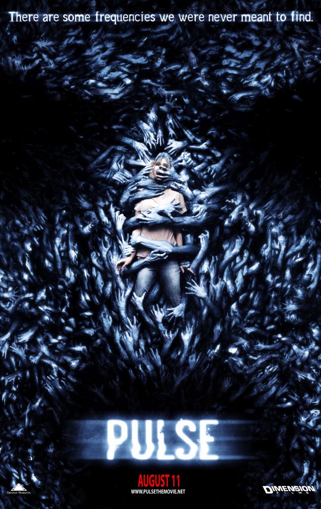
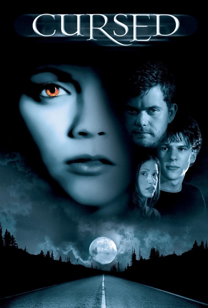
Then there is the fact that Craven didn’t direct this film, as originally planned. If you remember from my Craven quote in my review of Cursed, he mentioned that he was supposed to direct the film but the undying nature of that terrible werewolf movie made it impossible. Because of that and other “cursed” kerfuffling, Dimension ended up pulling the plug on Pulse. I have a feeling that the Craven/Dimension relationship really soured with the behind-the-scenes fiasco that was that horrible werewolf movie. In the end, (still) virtual unknown Jim Sonzero ended up directing Craven’s script while Craven went on to make several non-Dimension films.
So why did I decide to review this one? Basically because Craven did write the screenplay. I made a decision at the beginning of this series that I wouldn’t include the movies that Craven produced, since he didn’t really have a whole lot to do with those beyond ponying up the money to make them. Ultimately, I considered Craven’s writing and directing contributions to the horror genre to be the two most important from his career. I even strongly debated the inclusion of A Nightmare on Elm Street 3: The Dream Warriors, since Craven was listed as part of the writing team for that film. However, his original screenplay was so overwhelmingly rewritten, reworked, reshaped, and revised by numerous people that I didn’t really think it was fair to include it in this list. Pretty much the only thing that I think was left from Craven’s ideas for that film was the idea of Freddy having grown so strong by that point that a whole group of teenagers needed to defeat him rather than just one. Oh, and it was Craven’s idea to bring back Nancy.
For the American remake of Pulse, however, Craven was only one of two writers listed in the credits. The other credit (minus Kiyoshi Kurosawa, who wrote the original 2001 Japanese film, Kairo) is Ray Wright. He had one credit prior to this movie, and only has three more since, so I’m going to assume that he would have been the second-string writer on this script. Maybe Dimension brought him in to make changes to update it or make it more in line with what the Weinsteins wanted. Who knows. The bottom line, though, is that the script is definitely a mostly Craven product.
Unfortunately, it’s also one of his less well-made products. True, he might have been able to work some miracles with the script had he gotten to direct it as he had wished. He would have had say in casting, in locations, in filming choices, in rewrites as he went along
I’m going to start off this review by doing something that I’ve tried to avoid until now (pretty much because I can’t control what YouTube keeps and what they remove): I’m going to post the movie trailer.
Pretty spiffy, right? It’s why I couldn’t resist. I’ve spent so much time in these reviews talking about how Craven wanted so very much to break out of the horror pigeonhole and direct something else. And then he got his wish with Music of the Heart, which showed that he could actually do more than horror when given the chance.
Of course, this confused the hell out of everyone. Craven followers didn’t understand why he wasn’t doing horror. Non-horror people didn’t understand why his name was associated with a movie about violins rather than violence (“What’s all this fuss I keep hearing about violins on television?”). Next thing you know, up was down, night was day, left was right, cats became needy and dogs became aloof, and then all of society imploded.
Okay, not really. But I loved how this trailer kind of toyed with the fact that there no longer was certainty that Craven’s name would guarantee horror. But a rom-com? Duke! Don’t you toy with my emotions!
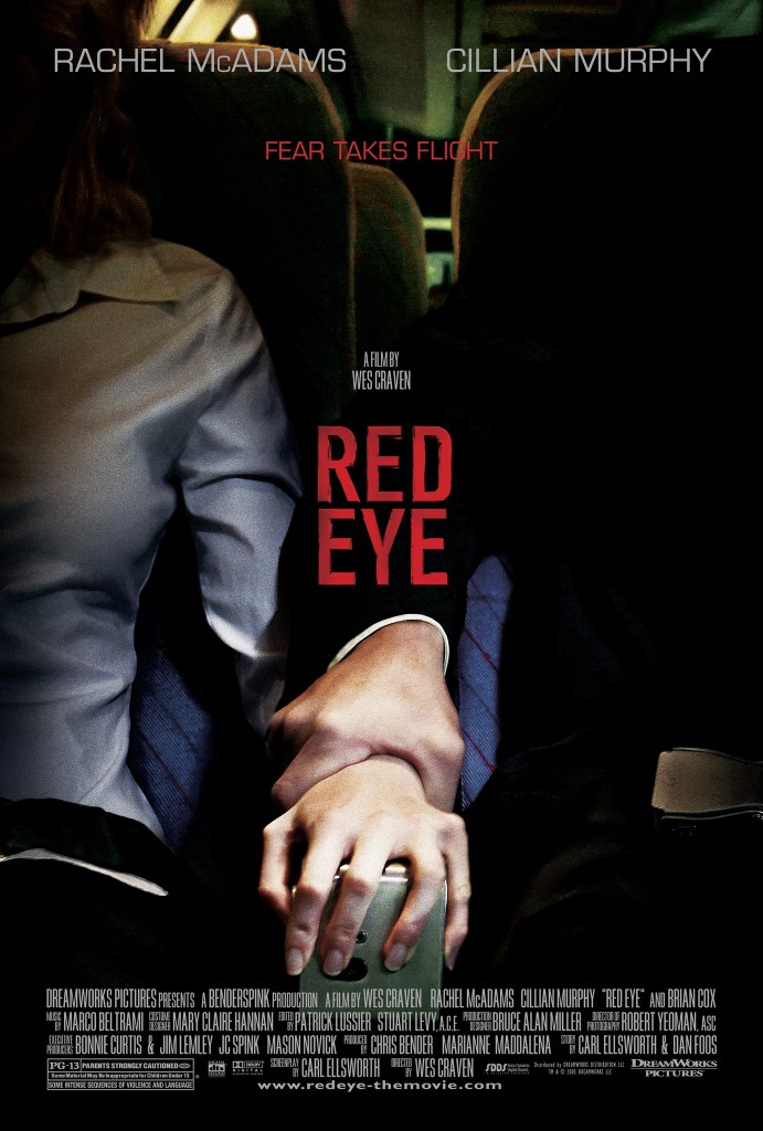
Of course, we didn’t get a romantic comedy, but I give total kudos to the person who cut this trailer. It’s fantastic in all the best ways. And, of course, we didn’t get another horror movie with 2005’s Red Eye. Instead, Craven gave us his best take at a Hitchcockian thriller, which to be fair? Is a pretty damned good take.
Don’t get me wrong: The overall premise of this film is totally hinky. You kind of have to ignore the main goal of the plot. It might be hard, but ultimately, it’s really good advice.
What should you pay attention to in this film? The fact that this is possibly the most technically precise film of Craven’s entire oeuvre. True, many films throughout his career have critical technical merit. However, this film is so streamlined and so precise and so very focused. It’s definitely Craven’s leanest film, not even hitting the 90-minute mark. However, that just means that every scene, every line, every look (especially every look) has poignancy and purpose.
I mentioned already that this is Craven’s most Hitchcockian movie. Honestly, this could have been called Strangers on a Plane if you wanted to be cute. It’s funny because screenwriter Carl Ellsworth’s next movie after this would be Disturbia, which is basically Rear Window for millennials. Clearly, Ellsworth had a Hitchcockian sensibility in mind when he wrote this script. It’s got that great sense of pacing and purpose, plus killer character interactions that become the everything of this movie.
Honestly, the casting of Rachel McAdams and Cillian Murphy as the two leads, Lisa and Jackson, could not have been more fortuitous
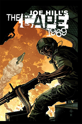
Quick review time, denizens. The Cape: 1969 is prequel to The Cape, which I reviewed at the end of last year. Again, we’ve got Jason Ciaramella writing the graphic novel script for Joe Hill’s original story, with Zach Howard and Nelson Daniel handling the artwork.
For this story, we learn how the Marine Corps patch that Eric’s mom had stitched onto Eric’s cape when he was a little boy was able to make it possible for him to actually fly. It’s a…bizarre revelation. It’s also a revelation that carries with it an extra reveal concerning Eric’s behavior as an adult who discovers that the cape can make him fly.
I don’t really have much else to say about this novel. Any more and I run the risk of ruining secrets. It’s a quick enough read, if you’re interested in the story. In fact, if you’re really interested, Amazon sells a deluxe edition of both graphic novels together.
Final Verdict: Even though I could get both together in one edition, I think I’ll pass on this story. It was an interesting enough way to wile away some time while sitting at the service shop getting a tire replaced recently, but it’s not really a story or artwork I feel compelled to revisit.
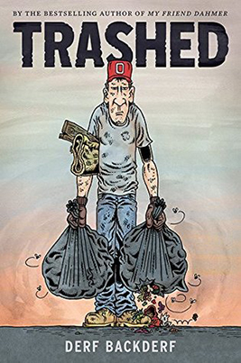
A few years ago, I read and reviewed Derf Backderf’s graphic novel My Friend Dahmer. Clearly, I didn’t really think all that much of his offering, based on my review. However, I did find his artwork to be compelling. There’s something about the elongated caricatures that I find visually soothing for some reason.
Therefore, when I saw Backderf’s latest graphic novel, Trashed, at the library, I decided to give him another go. With this novel, he offers another true tale, only this time far less salacious than his exploitative exploits with Jeffrey Dahmer. It was, however, disturbing in its own way. Backderf tells about his time as a trash collector, interspersing his personal vignettes with facts about trash collection in the United States. The true factoids were deeply disturbing. How we handle refuse in this country is appalling and completely unsustainable. Should we pay more attention to our trash levels? Absolutely. Will this book bring light to the subject? Honestly, I doubt it. Not that many people read graphic novels, and those who do typically don’t want to read graphic novels about…trash. That’s a shame, though, because I thought that this was a salient and provocative book.
Final Verdict: I found Backderf’s latest novel also disturbing, but not for the same reasons. I also found this novel worthy not only of reading but also of action. We need to start doing more to address how much trash we produce globally and how we can reduce that, not only through recycling more but also through rethinking how we package products and how we can make products last longer, thus reducing how often we have to replace them. Would I add this to my library? Possibly. I haven’t quite decided yet.
…the Cursed experience was so screwed up. I mean, that went on for 2-1/2 years of my life for a film that wasn’t anything close to what it should have been. And another film that I was about to shoot having the plug pulled
And so we reach the final Scream within the original trilogy. Was it always meant to be three? I’m not sure. I know that Kevin Williamson submitted the first script with a treatment for at least one sequel. Later, however, I heard him say that he always envisioned this being a trilogy. True or not, that’s what the franchise originally became and, even though Williamson was unable to write the script for the third film, we were lucky enough that Wes Craven returned to direct Scream 3 (thank you, Meryl Streep, and your lovely violins).
First, the two elephants in the room. As already mentioned, Kevin Williamson did not write the script for the third movie. That task went to Ehren Kruger (which is the most perfect last name for a movie directed by Wes Craven, amirite?). At the time, Kruger had written only three things, but he would go on to write a couple genre fiction favorites, IMHO, like the American remake of The Ring and The Skeleton Key. Of course, he’s also been behind those Transformer movies, so take it all with a grain of salt and a large margarita. Williamson would later state that he had a completely different idea for the direction of the third film, which ultimately he kind of did with Scream 4. Honestly, though? His original idea sounds really hokey. I mean, I’m sure that the original idea for the first film might sound hokey as well if reduced to one line, but this? Eh.
Second, there was a lot of push-back in Hollywood at the time that Dimension finally started gearing up to make the third film. Columbine happened the previous year, and of course, in a mad dash to find one simple explanation for something horrifically inexplicable, everyone wanted to blame the movies. Therefore, a lot of people wanted to completely disconnect the third film from its origin story and its two murderous high school students as well as scuttle Williamson’s original idea for the third film. It was Craven, however, who fought the hardest against white-washing Scream‘s history. He ultimately “won” against those who wanted to reduce the importance of the original story, but his price was the blatant increase in slapstick, nonsensical humor throughout this version. It’s the most purposefully silly of all the Scream films, which was both disappointing and distracting (which was the purpose, so well played there, guys).
So there are the two reasons that a lot of people usually bring up to point out why this is the worst of the Scream films and the weakest link in the trilogy. Do I feel this way? No (except about the Jay and Silent Bob cameo, because that was just pointless). To be fair, I did feel as though this was the weakest of the original trilogy when I first saw it. I thought it started out really well, carried a solid pace, but lacked the scares that I was anticipating and at times did play like a live-action version of Scooby Doo (which, honestly, I don’t really mind all that much. Because Scooby). Also, I found the ending to be the most anticlimactic of all the trilogy.
However, revisiting the film over the years, especially for this series, I’ve turned a more critical eye to the direction and the focus of this film. I honestly think that, if you look at this from the thematic perspective of Sidney as the keystone, take into consideration Randy’s admonishment to return to the beginning, and recall how beautifully and consistently Craven has interwoven reality and fantasy (particularly of the cinematic variety) throughout the trilogy, then this final entry into the original triumvirate indeed stands alongside the other two as a strong entry and ultimately a satisfying conclusion to the trilogy.
Now I’m finally going to go back to the beginning myself and talk about one of those points, which I wanted to save until now rather than reiterating in each review. Williamson’s original script was, at its heart, a love letter to the horror genre, particularly to John Carpenter’s original Halloween. Who wouldn’t want to write a love letter to that film, though, right? In the first film, we’ve got all these self-aware horror-cliched characters roaming about, spouting the knowledge they’ve gleaned from films like Halloween. They’re also using what they’ve learned to perpetrate their own horror films in real life. The line that separates those worlds for most people have blurred into non-existence for these characters, leaving them with the viewpoint that both realms are as real or as fake as they wish them to be. What better way to visually and aurally represent this than in the scene in which Dewey is searching Stu Macher’s house while we can hear the musical cues from Halloween playing in the background?
For a film that had been overlapping and interweaving reality and cinematic fantasy throughout the entirety of its run time, something so small as syncing that scene with the original score from Carpenter’s classic was a tiny slice of brilliance, if you ask me. It perfectly captured that surrealistic blending while using the audience’s knowledge of one element to increase the suspense and tension of the other element. Plus, the fact that nothing actually happens to Dewey while the action is reaching its denouement in the film playing in the background is a nice touch by Craven of, “Ha, you might know what’s going to happen there, but I’m not going to let you see my hand quite that quickly. You’re just going to have to wait.”
Of course, this same blending continued in Scream 2. I did talk about two of those moments: Maureen Evans’s death at the beginning of the film, committed right in front of a crowded theater of people who at first cheer before realizing that what they are witnessing is not part of the promotional pretending; and the dress rehearsal scene in which Sidney thinks the Ghostface Killer is among the masked members of the Greek chorus. Additionally, we get to see “scenes” from the movie-within-the-movie Stab, in which Craven and Williamson take collective swipes at how Hollywood can oftentimes bend the reality of a “true story” in ridiculous and trite ways.
As for this film? Well, this one ramps up the blending to a new level, by bringing the central action right onto the set of the latest Stab film and using as the central characters the cast from that movie. In doing this, we not only see the continuation of the blending of reality and fantasy, especially when we get the treat of watching the two “Gale Weatherses” interact, but we also realize that this is truly how we are going to go back to the beginning in two surprising ways. We also hit upon the “Sidney is the keystone” aspect since one of the focuses of the Ghostface Killer in this film is to bring Sidney out of hiding.
[Loba Tangent: I don’t want to go on about the casting much for this film since I have so much else to write, but can I just say Parker Posey is brilliant? Her interactions with Courteney Cox throughout this film are fantastico.]
As I noted in my review of Scream 2, Neve Campbell was only available to film for something like 20 days for this movie. Therefore, Sidney’s role needed to be pared back, which was a decision that admittedly saddened me but also one that I think worked perfectly for this story. I had noted in my review of the preceding film that Sidney’s hold on reality was starting to come under question by those around her. The moment during dress rehearsal in which she panics over believing that she has seen the killer among the other actors on the stage with her was the moment that truly slammed this into our brains.
With this third film, however, we must wonder right away if all that Sidney has survived hasn’t finally shredded her increasingly tenuous hold on reality. She has sequestered herself away from everyone, with only her father and Dewey knowing where she is. She lives behind locked gates and bolted doors and security systems with only a Golden retriever as a constant companion. It’s no surprise, then, that when reports of the latest round of murders starts to reach Sidney that she starts having nightmares, which turn into one of the most satisfying scares from the entire trilogy. The sequence with Maureen Prescott’s ghost calling to Sidney:
Sid… come here… Mother needs to talk to you… Everything you touch, Sid, dies. You’re poison.. you’re just like me… you’re just like me… [she lowers herself to the ground leaving bloody streaks on the window] What have they done to me? They’ll do it to you… they’ll do it to you…
First off, Craven’s setup of this scene plays as perfectly unnerving, not just because of the obvious creep factor but also because this is the first real view we get of Maureen Prescott beyond photos. And, sadly, this how she lives in her daughter’s mind: A haunting, terrifying figure who gives voice to all the fears that Sidney has been carrying within her since her mother’s murder
Deprecated: Function get_settings is deprecated since version 2.1.0! Use get_option() instead. in /home/ih1v0f0zxragxwcy/public_html/blog09/wp-includes/functions.php on line 6078
Deprecated: Function get_settings is deprecated since version 2.1.0! Use get_option() instead. in /home/ih1v0f0zxragxwcy/public_html/blog09/wp-includes/functions.php on line 6078